01 designers and 02+ engineers.
LYNX
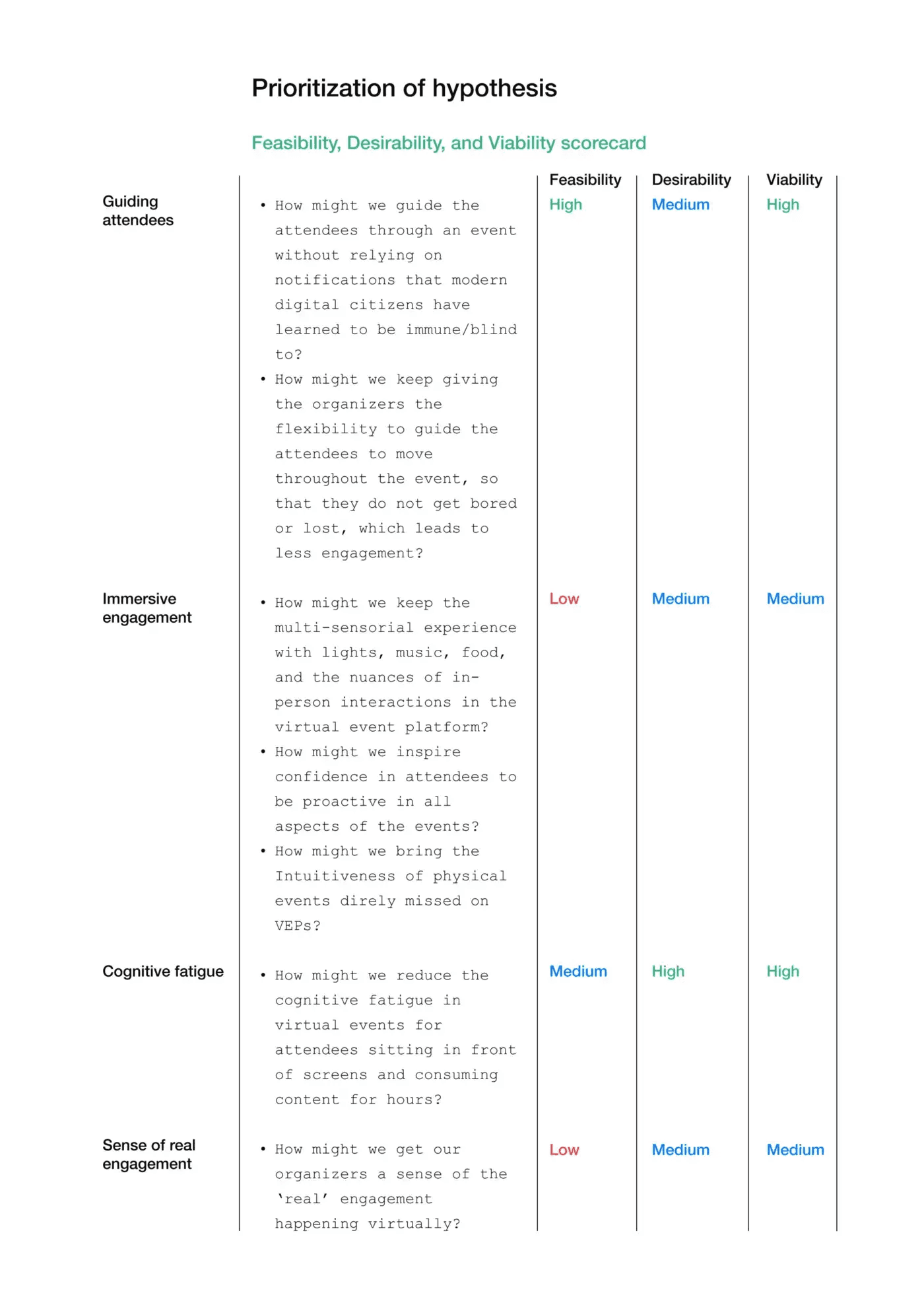
How might we keep giving the organizers the flexibility to guide the attendees to move throughout the event, so that they do not get bored or lost, which leads to less engagement?
How might we inspire confidence in attendees to be proactive in all aspects of the events?
How might we bring the Intuitiveness of physical events direly missed on VEPs?
problem statement rich and credible.
UXR LYNX Report
Event Health Survey
G2 Reviews
Organizers feel that attendees need constant directions to follow the event progression It was easier for the attendees to ‘follow the herd’ in in-person events. But since the virtual attendees experience events in isolation, it’s hard for them to get a sense of where the crowd is at; currently only shaped by notifications and nudges which users are increasingly immune to You’ve got to sort of guide the people around the way you want them to go. Another old design mantra is, you know, “You shape your house as they shape you.” If it’s not really clear, the path of the journey from the time I get a ticket, all the way through to logging in and getting acclimated to your platform, and then you never know that I’m in the right place at the right time, all those things are … those are basics. — Mark michealson (EMC), Hopin Customer
The “Happening Now” button is a thoughtful addition (kudos to the team!) however I believe it should be moved from secondary to a primary feature for greater visibility and for it to be more useful. “ — Julian Ayim, Hubilo Customer
we needed an announcement board/information centre in the reception area where we can put important messages. There are a few changes that are been added as part of V2 that could be avoided, like having the live session displayed in the reception area was much better in V1 rather than the happening now tab in V2. — Rohit, Hubilo Customer
There is no way to check the number of people in a session or the number of people online which was extremely disappointing, as event organizers we do feel the need to review if the delegates have attended the event or if they are present during the session. — Kanchan, Hubilo Customer
Need for real engagement data behind closed cameras and muted mics Since large and mega-events cannot be tracked on an individual attendee level, it’s hard for the organizers to gauge the real degree of engagement. I mean, first, the attention span of the online delegates will never be the same as being in life versus ritual does also, as much as we want to have this kind of intimate meeting session one to one, right, it’s really hard to really retain the engagement. And also people can be easily distracted online, right? Because we are using the web browser notification of emails or WhatsApp chats or anything is easily distracting for all of us. So I’m not sure actually, whether there is such a way that we can really measure… — Felix, Dorier Group, Hubilo Customer
The pop-up notification box should be more prominent and centralized on the event page easy to facilitate moderation — it is very easy to miss it from its current positioning. The ability to have pop-up messages that go to all attendees. Not just in the Event Feed, but in actual push notifications. — Eric Ellis, Hubilo Customer
Notifications should have been pop-up(most people don’t look up and check their notifications) — Hubilo Customer
Notifications of updates to the platform would be helpful in navigating the platform post update as it makes us aware of the new features we have access to. Also, a list of add-ons would also be helpful. — Hubilo Customer
We hope to see improvements by adding Virtual Background to 1–1 meetings and sound notifications on the platform. — Grace, Hubilo Customer
Would love it if notifications on the site could also be sent as emails to the attendees. — Nima, Hubilo Customer
We set out to give a solution for making the attendees aware of the crowd and find new ways of notifying them so that they don’t miss any major part of the event.
In-person events had very apparent visibility of what was happening around and it was easier for organizers to control the flow of people by ushering them. With virtual events, organizers are currently facing the challenge of the lack of visibility of attendees throughout the event. Similarly, Attendees also face the same issue, in an in-person event attendees “follow the herd” and land up where the crowd is more, But in virtual events, they are isolated and struggle to navigate throughout the event.


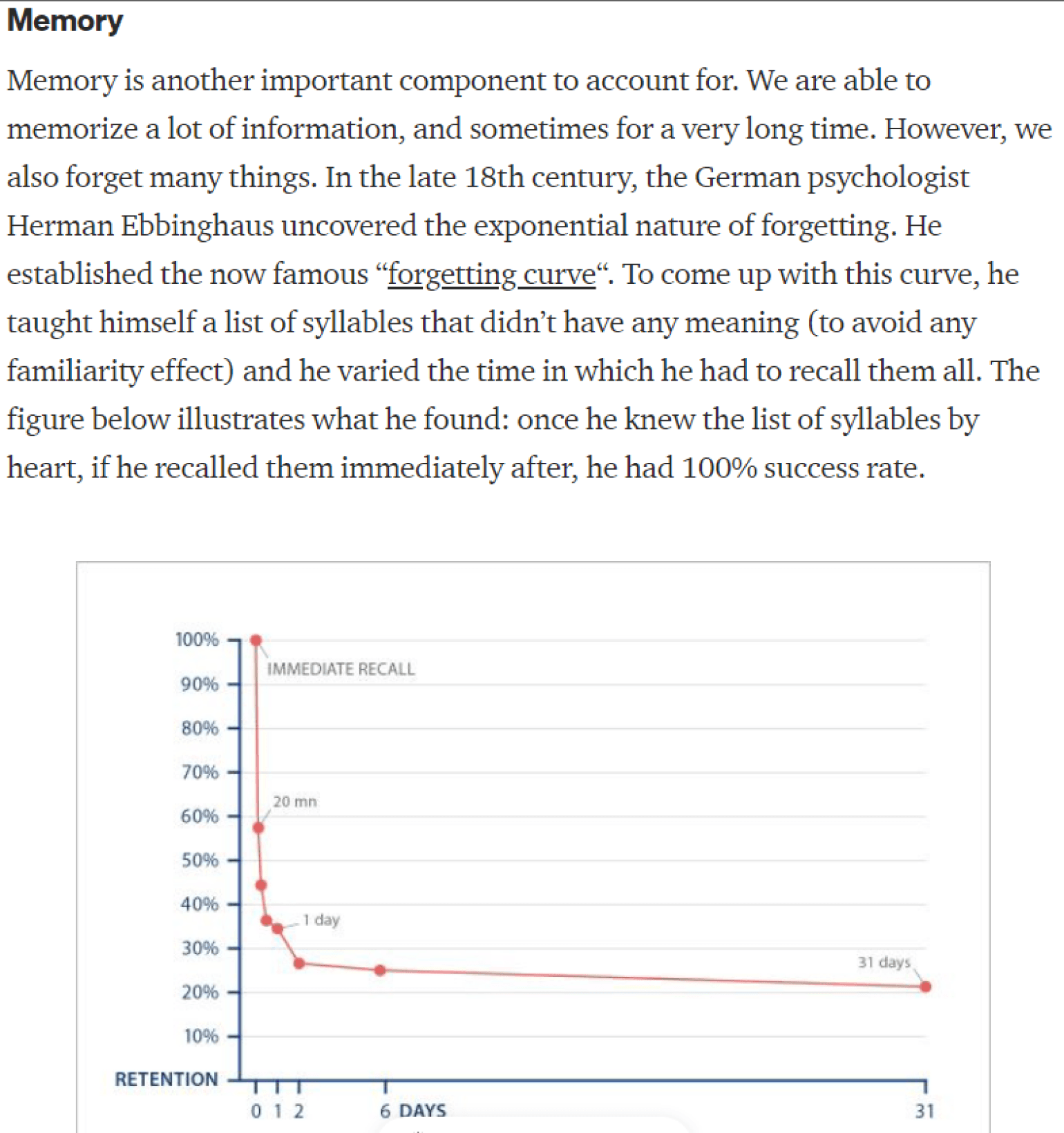





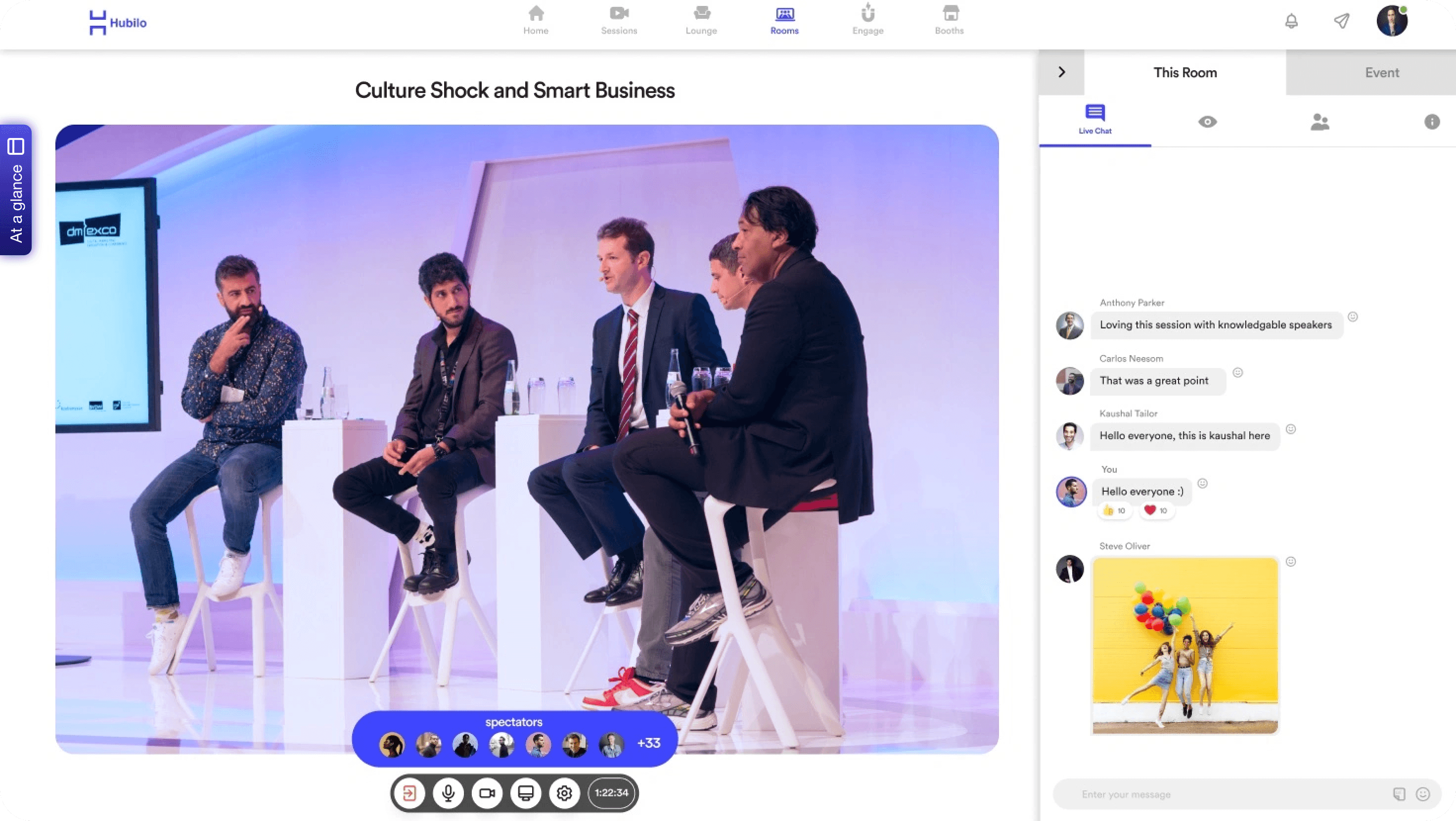
We’ve added a happening now button on the left side of the screen. In later versions, we may offer the flexibility to the organizer to change its position.
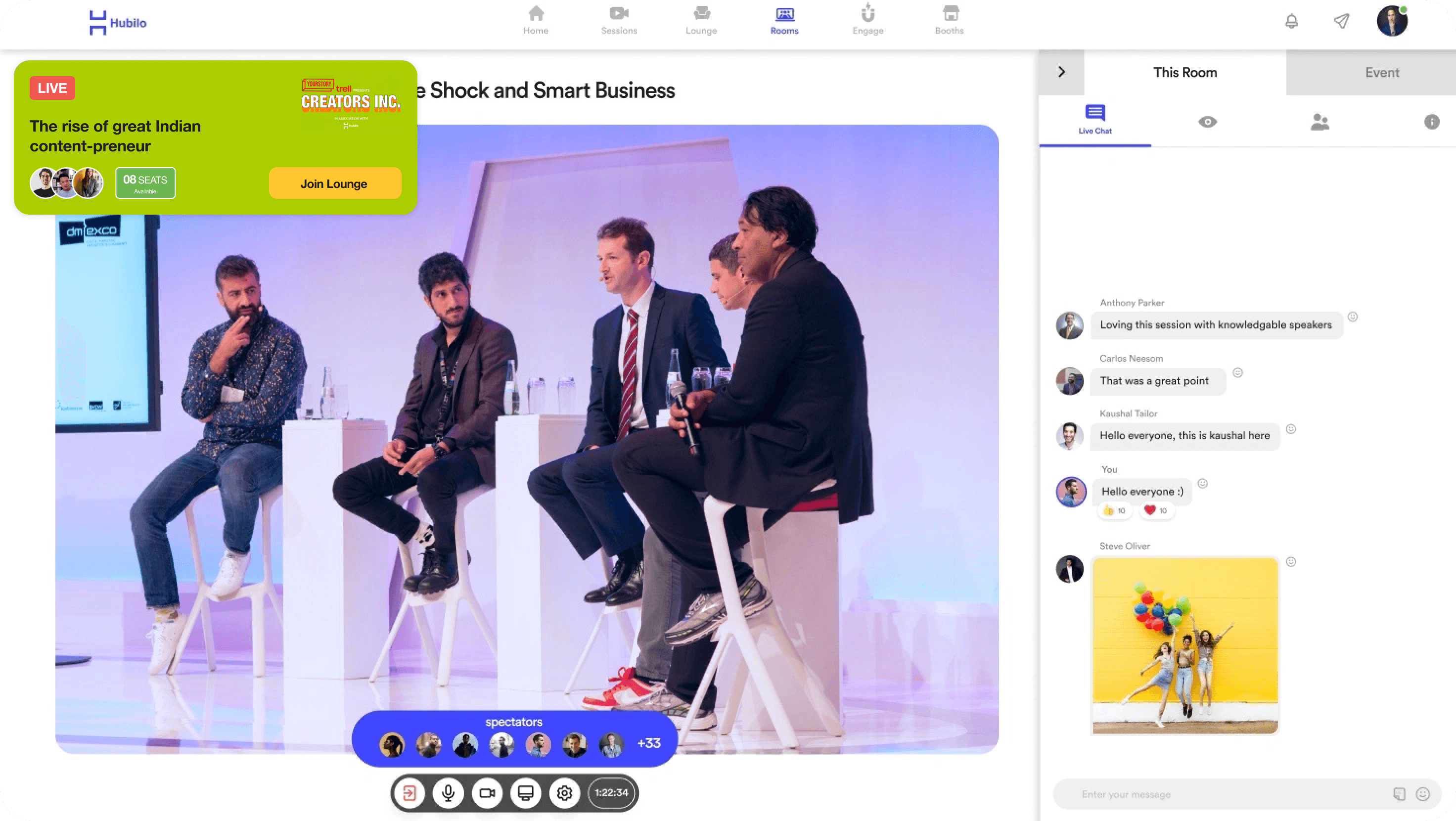
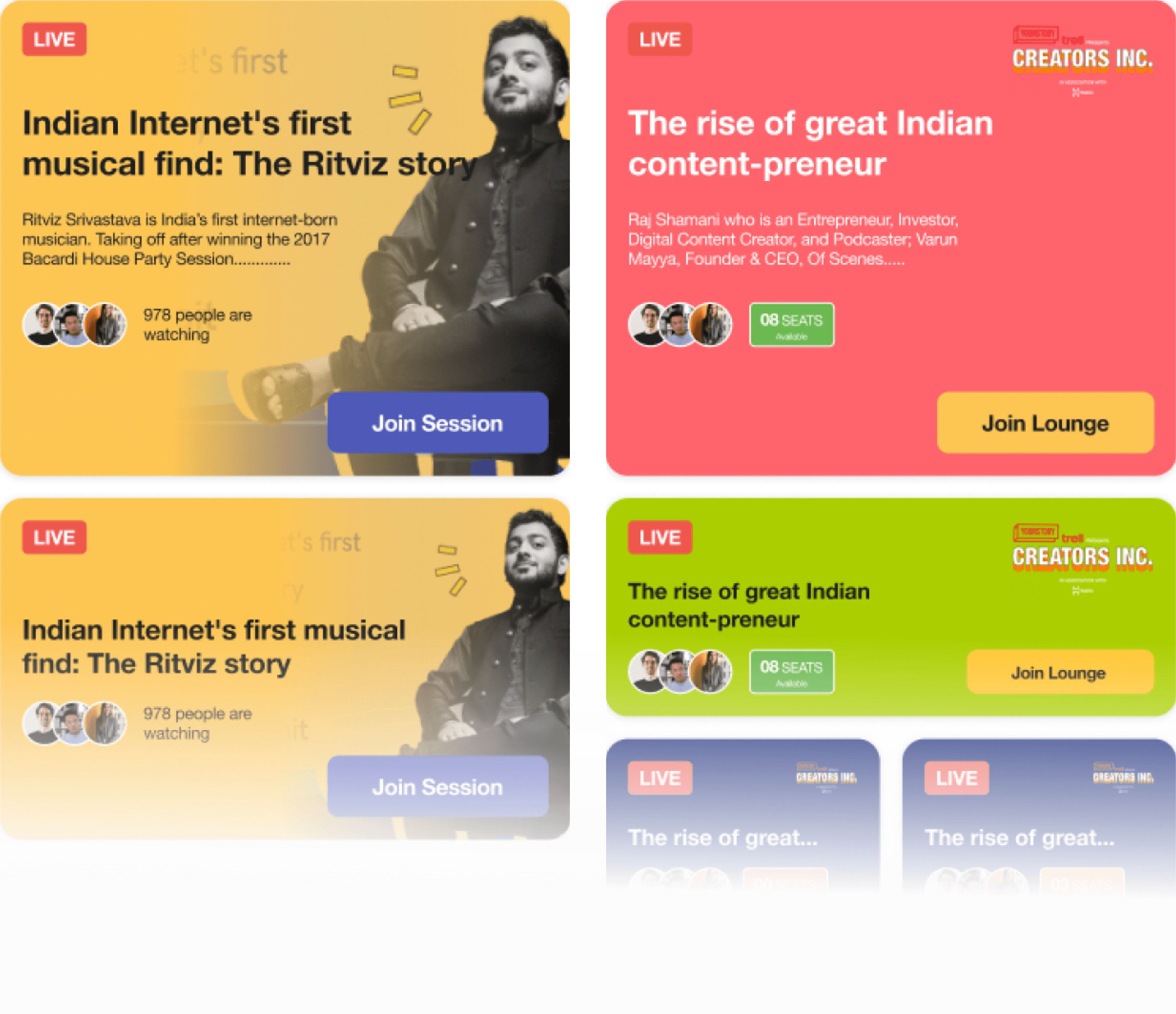
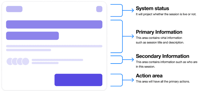
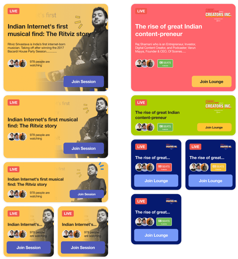
Once clicked on the “Happening Now” button a pan will open that will contain all the widgets for the live sessions, lounge, and rooms. Anyone can join from anywhere on the platform.
The widgets will contain necessary information as per the context of each widget.
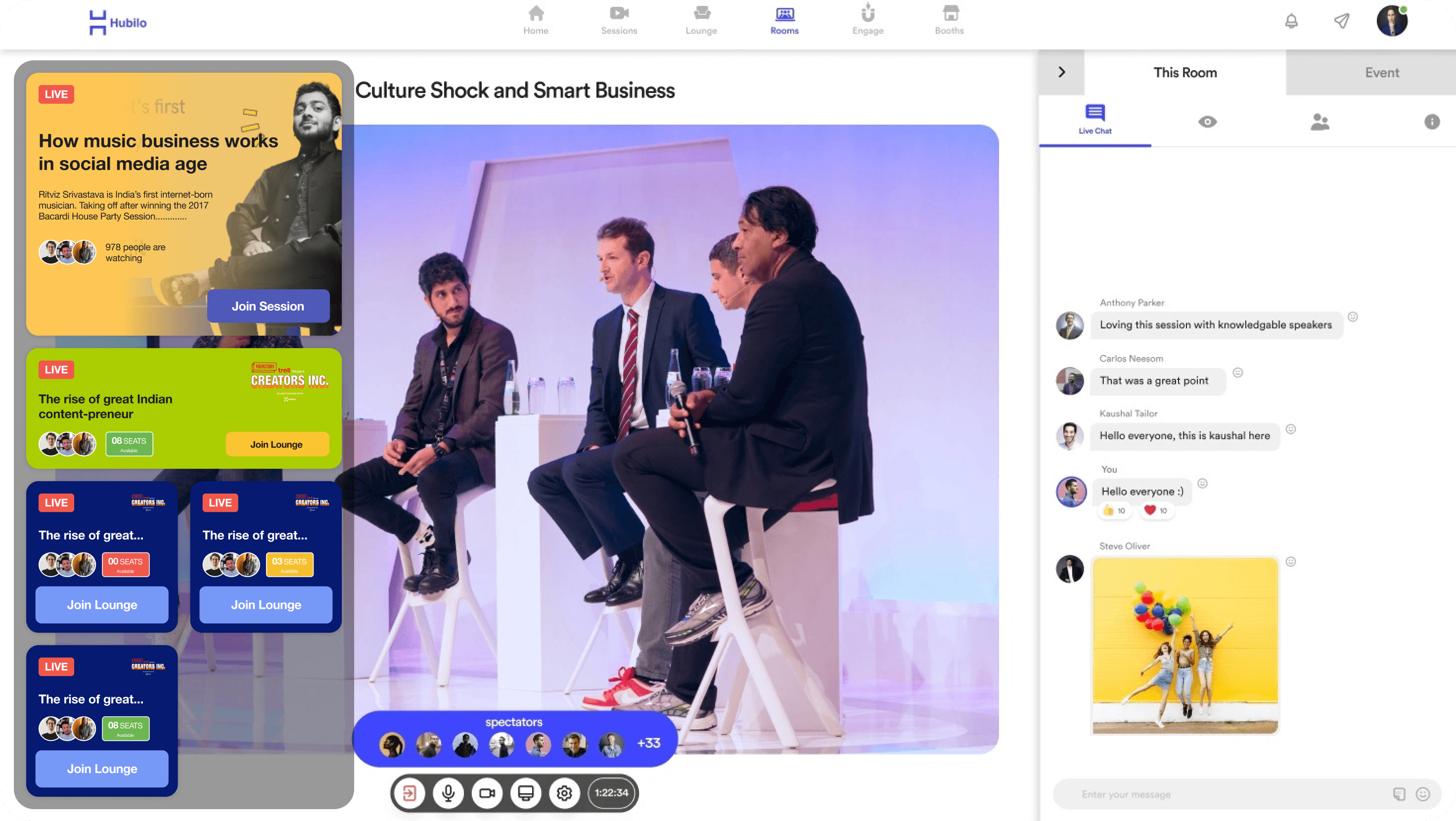
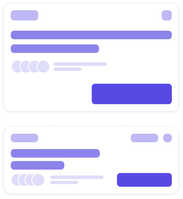
If any session, room, or lounge comes live a snack bar will appear with a sound to take the attendee's attention for a while, this will help prevent the notifications from being ignored.
The snack bar card will have a CTA as per the card’s context so that it will be easier for the attendees to take the action quicker.
If the cards remain unattended for a while they will disappear after some time, without hindering the viewing experience.
