Designing an experience to nudge the users to land on the pricing page is one of them. This project was special in a way as it was my first ever project as a professional designer, and it involved various touch points for learning such as login & onboarding, and lots of incremental improvements at the dashboard without distracting the users from their main tasks.
02 designers, 01 product managers and 05+ engineers.
We offer four plans for our customers including a 7-day free trial. Each plan comes with different features at different price points. As designers, we are responsible to add value to the customer experience and take incentives for that experience. It is very crucial for us to assist the user to explore all the perks and value propositions of the product in the free trial period so they opt for the premium plan and the initial step to purchasing a plan is to visit the pricing page.
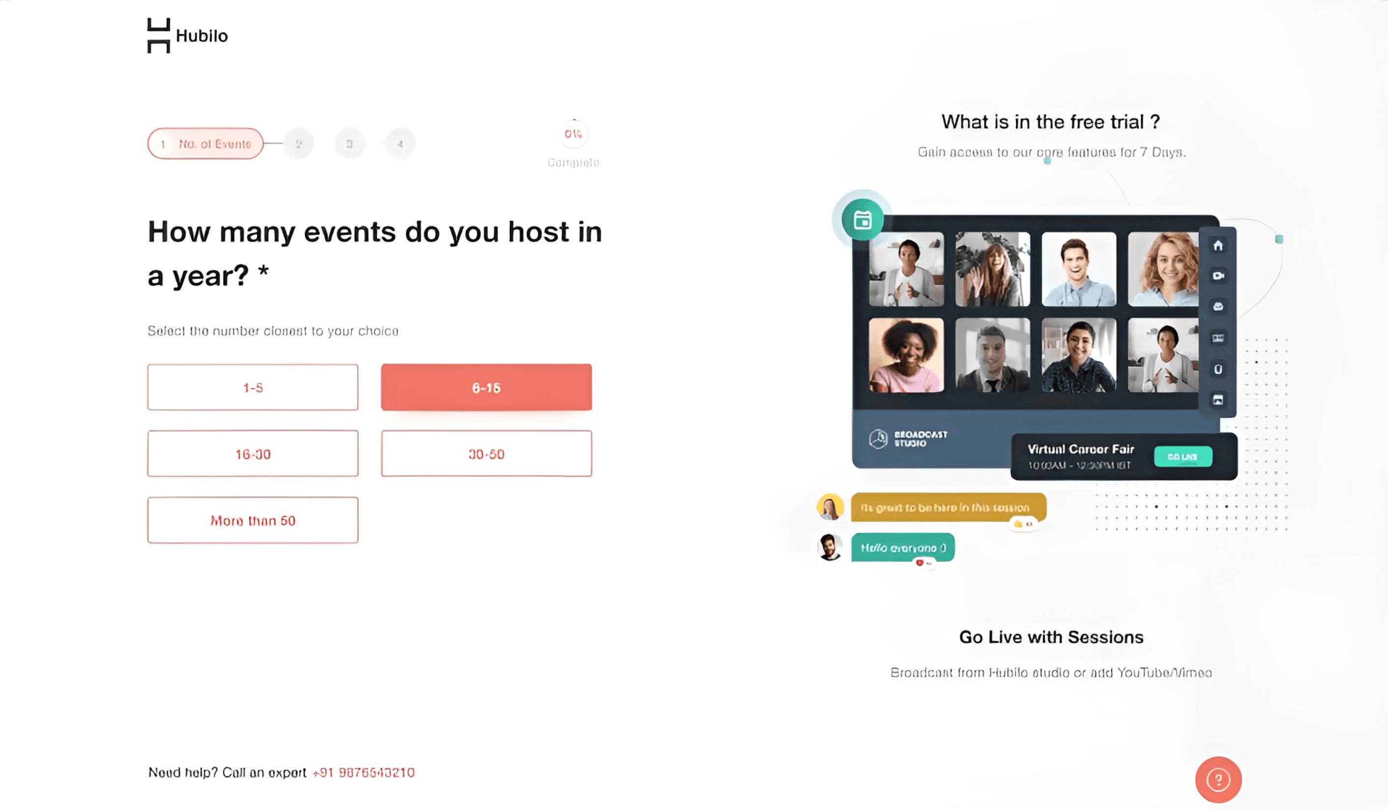
Current onboarding involves multiple steps, offering lesser gains/takeaways for the end-user.
Users are unaware of the product’s USP as it is not presented during or after the onboarding.
The fields in the onboarding process do not explain why new users need to fill out certain fields. Users should feel comfortable giving us the necessary information.
The onboarding process does not build any anticipation, it is very essential to keep the user’s interest up.
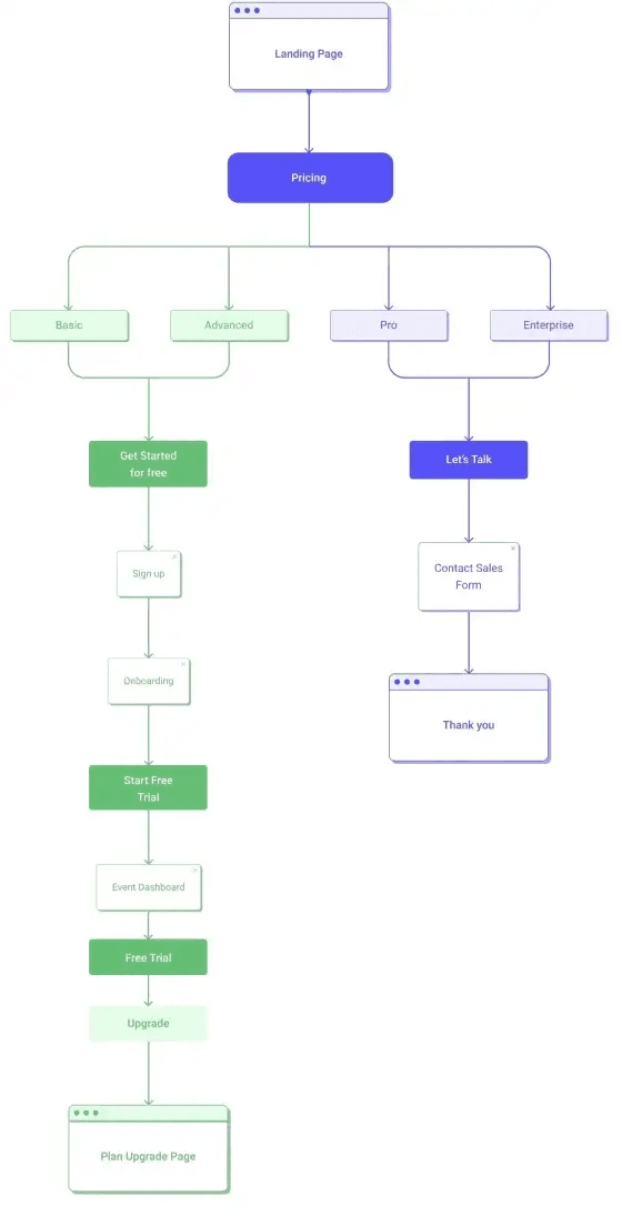
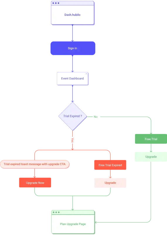
The current user journey flows don’t have enough nudges for the user to the view pricing plan page
After the onboarding, the user lands on the event dashboard with barely any instruction for the user as to what to do next and why they should invest their time into it.
The free plan allows all the offerings on the table, some restrictions would nudge users to opt for the paid version.
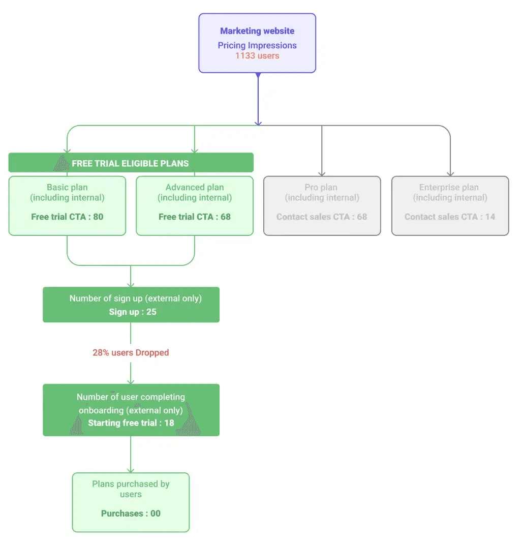
Weak value proposition conveyance leading to a lack of conviction and interest results in drop-offs during the user onboarding process. The onboarding experience has a compounding effect throughout the UX.There was a 28% drop-off during the onboarding process
Users don’t seem to follow through with the onboarding screens and are dropping off during the flow. [Action: Must evaluate soft factors in onboarding — value, desirability, credibility and evaluate these screens for effective retention]
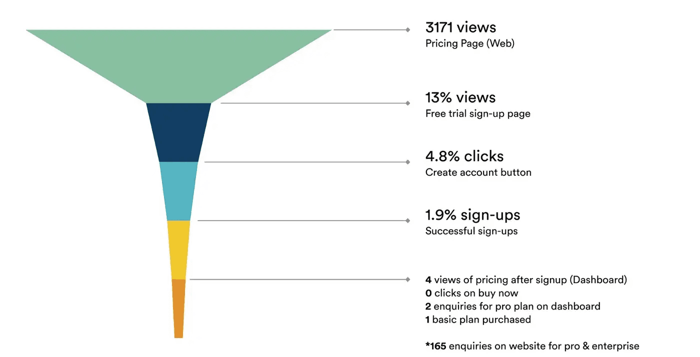
Lack of sufficient user journeys leading to the pricing page. Only 14% of the users viewed the pricing page after sign-up
Data suggests that of the 28 users under observation after the free-trial sign-up, only 4 users visited the pricing page. Our current hypothesis is that there aren’t a sufficient number of UJ avenues for the user to land on the pricing page.
7% of these users viewed the pricing page immediately after sign-up (High-intent users)
All users (14%) viewed the pricing page within the first 2 days of their use.

Lack of guided exploration after sign-up
Few users created/used attendee engagement tools like contests and surveys
Few users used/explored the organizer-focused USPs like ‘Brand your event’ or the ‘Sponsored ads’ section of the 14% of users who viewed the pricing page, and 10% of the users had created and published an event. They also successfully created rooms and lounges.
Decrease in the drop off during the onboarding process by X%
Increase impressions on the pricing plan of the dashboard page by Y%
Increase CTR on Buy Now button on the pricing page on the dashboard
Identify relevant touch points to nudge the user to navigate to the pricing page.
Conveying the USP upfront during the onboarding process.
Providing a progressive disclosure to the user to easily scan the information and take an action.
Providing actionable information for the user to navigate post onboarding
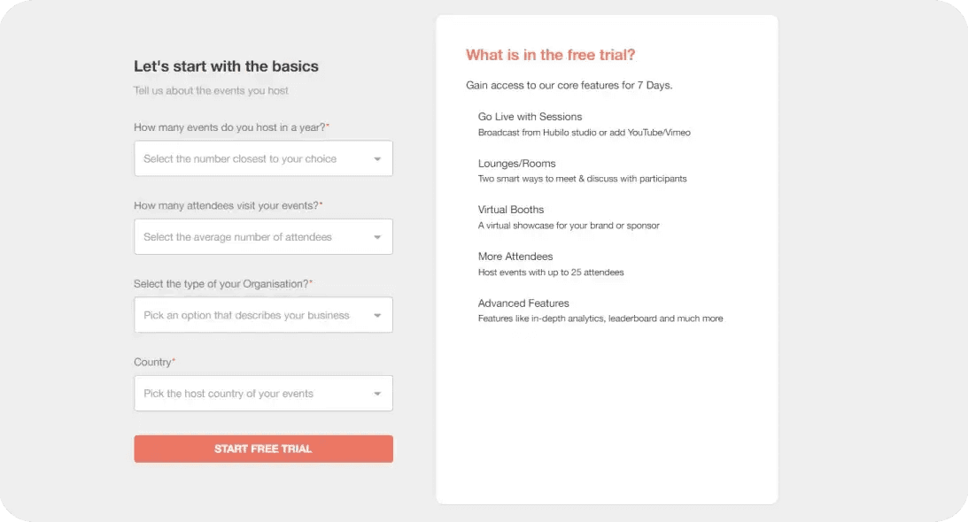
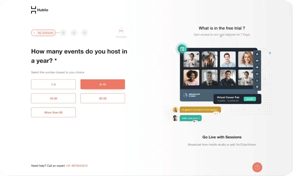
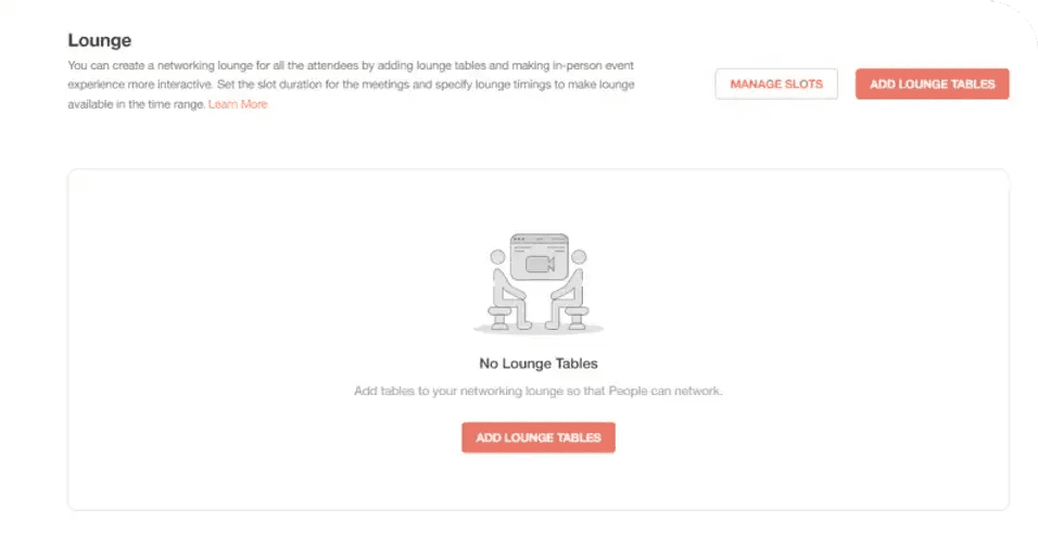
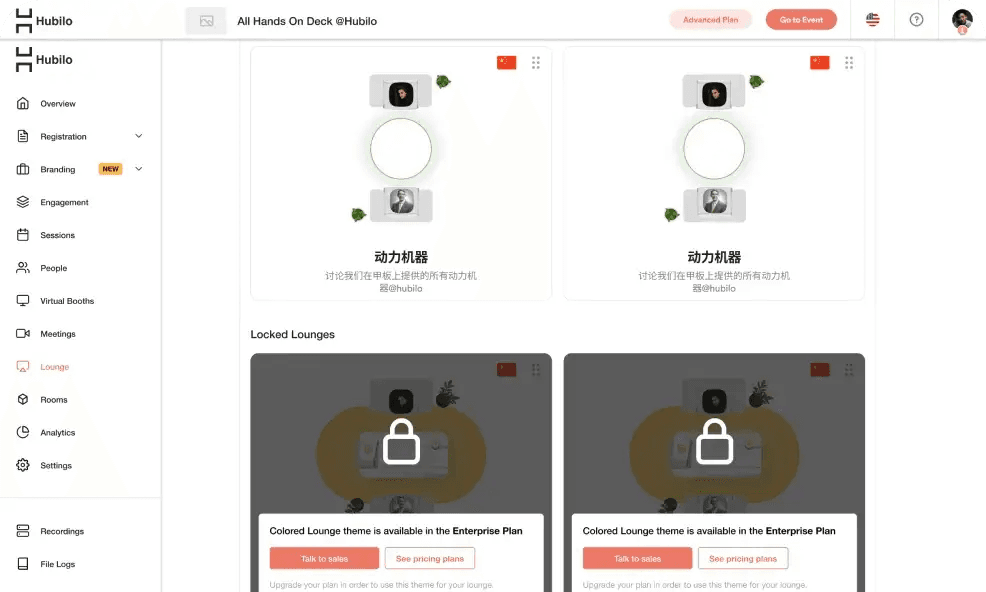
Introducing limitations in the rooms and lounges feature for the free trial users.
Introducing pricing page nudges in the rooms and lounges creation flow for users to learn more about the extra value-added when opting for the paid versions.
Add a free trial banner at the top of the organizer dashboard.
Keeping days left element prominent to create a sense of urgency.
All the available features are listed at the bottom of the component.
The free trial and plan chosen by the user to access the free trial with an expiry date is mentioned in the top right corner.
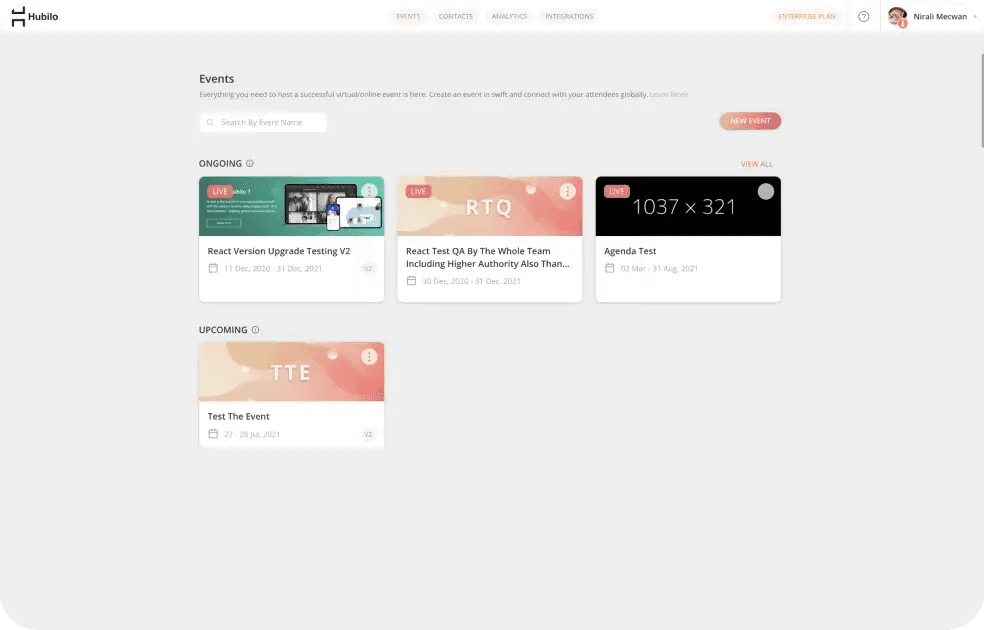
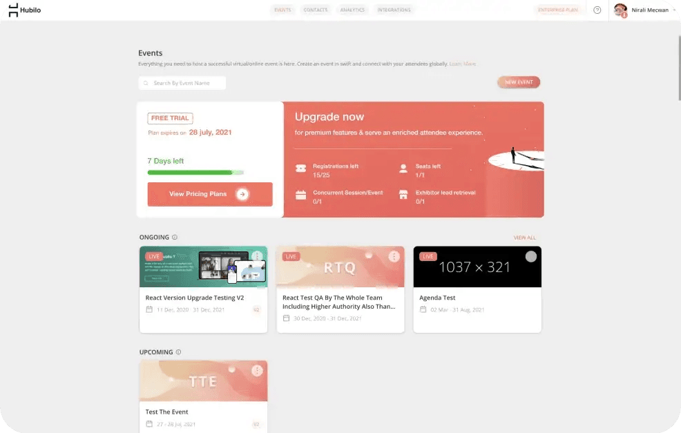
In conclusion, the design project aimed to increase impressions on the pricing page and reduce the drop-off in the onboarding process was successful in achieving its goals. The results showed a significant increase in impressions on the pricing page by 300% and a reduction of the drop-off in the onboarding process to 8% from 28%. Despite the constraints of budget and resources, we were able to create a meaningful and effective experience for both the business and its users. These results demonstrate the impact that design can have on user engagement and highlight the importance of considering design in all aspects of a business.