Reactions for Video Experience
Designing for Engagement
INTRODUCTION
There are many video experiences happening on the platform, some are on a large scale and some are small. Generally, the large audience video interactions are monotonous. In spite of having engagement features such as chats, polls, and Q&A, only a handful of users are interacting with it. The number is below 2% for most of the cases. We were responsible to come up with an effortless and discoverable experience to interact with the ongoing session, rooms, and lounge.
MY ROLE
Responsible for research, conceptualisation, design, and delivery of key feature areas.
THE TEAM
01 designers, 01 product managers and 02+ engineers.
TIMELINE
Jan 2022— Feb 2022
Why Reactions?
Emojis are everywhere in the modern world. We’re constantly using emojis to express ourselves and translate our emotions into a digital format. Reactions are a way of facilitating that emotional conversation online.
Human reactions are complex and varied
When we watch or interact with content it evokes certain emotions which vary from one individual to another and to express it in the digital world we need some medium to translate it to the community.
Easy communication
Emojis are more than playful shorthand for the written word. Most of the meaning derived from spoken language comes from nonverbal cues like body language and facial expression. For example, People use head nods to agree or disagree in real life, and in the digital world, a reaction is equivalent to a head nod in response.

Increased Interaction

There are certain levels of interactions in the digital environment. Such as liking a post, commenting, sharing, and direct messages. To perform these actions, each of them requires some level of effort. The idea behind reactions is to keep them in the lowest hierarchy of efforts while interacting.
What does it mean for organizers, hosts, and speakers?
Trigger
As these emojis will be displayed to everyone watching the session, this will trigger other users to react as well. This will lead to higher attendee and organizer interaction within that session.
Heartening
Whether virtual or physical events the reaction of the audience plays a vital role to encourage the speaker to perform better and get more reactions from the attendees.
Gauge
Reactions also act as a gauge to measure in real-time how well their content is being received.
Coversation
We will move from attendees who liked the session or watched the sessions to “attendees Loved the session” or “attendees were surprised by the session. The conversation moves from “Why attendees liked the session to “Why attendees loved the session” or “Why attendees were surprised by the session”. It will create more conversation, and an opportunity to explore.
Creating reaction
Considering the percentage of attendees interacting with the current engagement tools that demand more effort from the users, we set out to deliver a solution that caters to the job with the least effort required by the users.

How might we make reactions consistent,

effortless and discoverable

for our users?

How can we achieve this?
  • Creating designs that work smoothly for all the video-centric environments (Session, rooms, and lounge) of the platform.

  • Keeping it concise in terms of the complexity of choices and keeping the short journey of making a reaction to the content.

  • Clubbing it with the most important component of the current design to make it more discoverable by the users.

  • Ensuring that people trust the reaction made by other attendees of the event and it is not automated.

How can we measure success?
  • Increase attendee engagement % of people interacting with sessions/rooms/lounges Target Metric.

  • Adoption of reactions No. of reactions/session-lounge-room Feature Metric.

  • Understanding of Emojis No. of reactions with that emoji per session-lounge-room Feature Metric.

  • Understanding of Emojis No. of unique reactors with that emoji per session-lounge-room Feature Metric.

Planning the approach?
  • The ideal number of emojis present in the components of the reactions are 5–6. The proportion of emojis is divided into more positive reactions than negative reactions.

  • In most of the video-centric environments, the reactions are clubbed with the live chat to make it more real so it doesn’t feel like automated reactions because in live chat usernames are present and people may associate those usernames with reactions too. (Ref. Social proof)

  • The platform which involves a large audience has reactions upfront, approachable in a single click (For e.g. Facebook, Hotstar live matches, Twitch, etc.). On the other hand, platforms that have close group involvement have reactions approachable at 2 clicks (For e.g. Butter, zoom meetings)
Delivering the experience
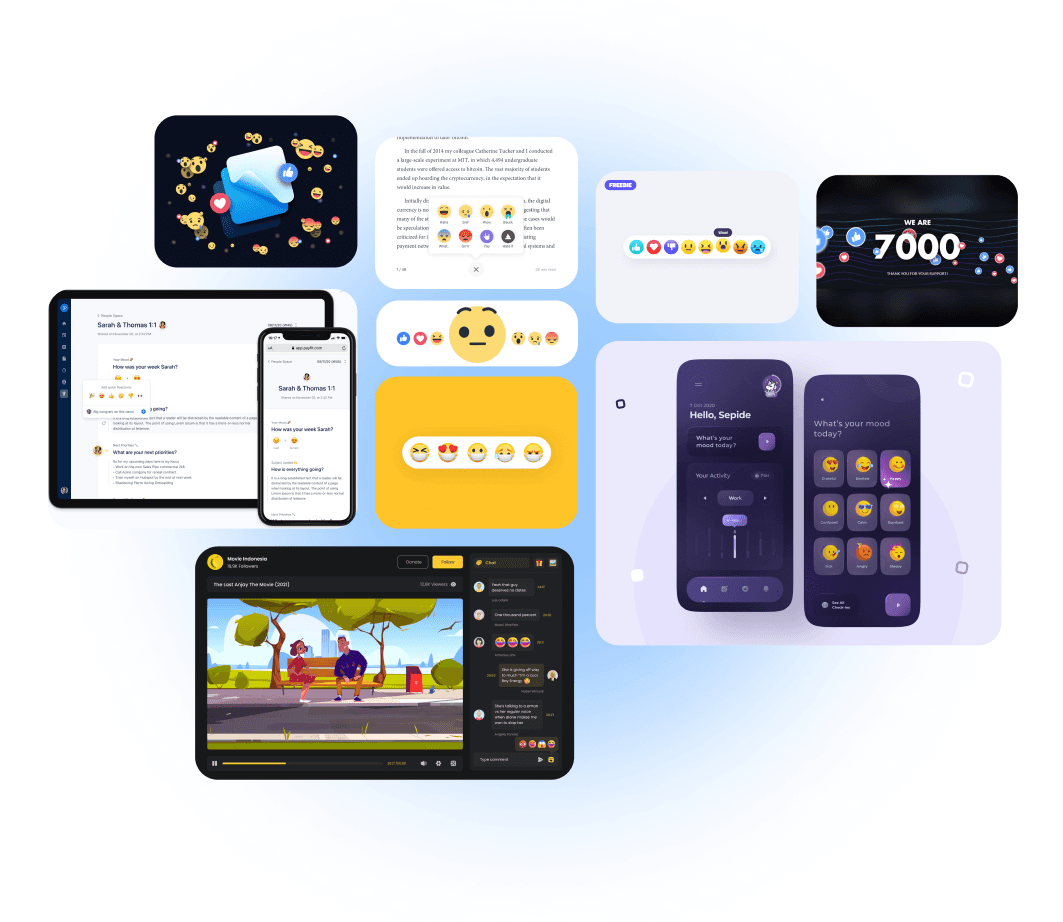
Once doing the required research and defined the goals of the feature, we set out to design the reactions keeping these parameters in mind
Discoverable
Discoverability
Most of the engagement tools appear in the right-side panel and to use it users have to navigate through the side panel. As backed by the data it is seen that most of the tools get undiscovered by the attendees.
Solution
We clubbed the reaction component with the necessary and important components to make it more discoverable and visible.
Social Proof (Problem area)
In most of the platforms, especially social media platforms, we found that reactions come up with either a Profile picture, username, or both. The main reason behind this is it looks real and instead auto-generated reactions.
Solution
We developed a story of how reactions will appear, the timeline goes like this, at first reaction will come with the user’s name and then it collapses to reactions only.
Grid View (Problem area)
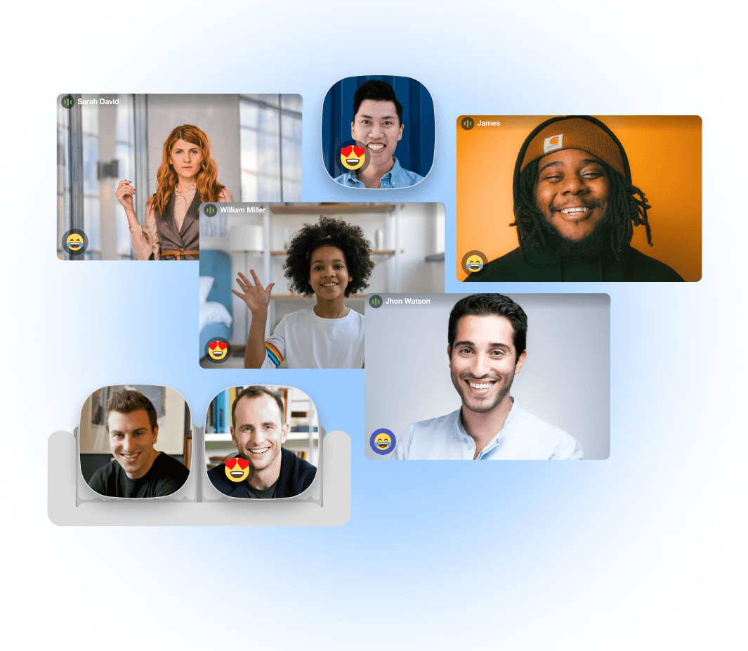
There are different types of participants in every event such as attendees, speakers, and hosts. The reaction of the participants who are in the spotlight needs to be highlighted on their video grid to stand out from the crowd.
Solution
We designed reactions for the grids that should be consistent in all the formats. The goal was to keep it intuitive so that users don’t have to find them in any case.
Conclusion
In conclusion, the design project focused on increasing engagement in the video watching experience and forming two-sided communication was a success. The introduction of reactions was instrumental in achieving the project's goal as it led to a significant increase in viewer interaction, jumping from 2% to 59%. This demonstrates the importance of considering user engagement and the role that design plays in creating a more interactive and meaningful experience. The results of this project highlight the potential for design to drive engagement and foster two-sided communication, which can ultimately lead to better user experiences and more meaningful connections.
Designed with Love ❤️